Clustering Example
This notebooks shows examples of how to perform a PCA and use several common clustering algorithms.
Open an interactive notebook:
Sign into the SHIFT SMCE Daskhub and select an instance size in a different tab
Follow this link
Select the “notebook” kernel
import sys
sys.path.append('/efs/SHIFT-Python-Utilities/')
from shift_python_utilities.intake_shift import shift_catalog
import xarray as xr
import pandas as pd
from sklearn.decomposition import PCA
from sklearn.cluster import KMeans
from sklearn.mixture import GaussianMixture
import holoviews as hv
hv.extension('bokeh')
import hvplot.pandas
pd.options.plotting.backend = 'holoviews'
import hvplot.xarray
Pre-processing
# Read in the data using the shift python utilities library
cat = shift_catalog()
ds = cat.aviris_v1_gridded.read_chunked()

# Read the data in from s3 dh-shift-curated
# ds = xr.open_dataset("reference://", engine="zarr", backend_kwargs={
#     "consolidated": False,
#     "storage_options": {"fo": "s3://dh-shift-curated/aviris/v1/gridded/zarr.json"}
# })

# Subset the data using the select method
aoi = ds.sel(x=slice(730300,731000), y=slice(3819660,3819050), time="2022-03-08")
aoi

# Filter out water absorbtion and other bad bands
badbands_file = '/efs/edlang1/AVIRIS_badbands.csv'
# Read in csv using Pandas and convert dataframe to a 1D numpy array
bands = pd.read_csv(badbands_file, sep = ",",header=None).to_numpy().squeeze()
# Combine the y and x dimensions and use the band bands mask to filter
data = aoi.stack(combined=('y', 'x')).reflectance[bands==0].T
df = pd.DataFrame(data, columns=aoi.wavelength[bands==0]).T
df

PCA
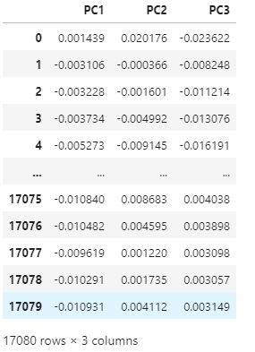
# Perform the PCA and convert the results to a dataframe
pca = PCA(n_components=3).fit(df)
pca_df = pd.DataFrame(pca.components_.T, columns=['PC1', 'PC2', 'PC3'])
pca_df
Kmeans
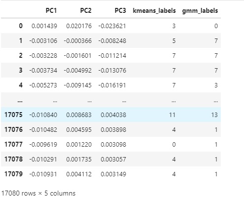
# Perform K means with 14 clusters
kmeans = KMeans(n_clusters=14, init = 'k-means++', random_state=42)
kmeans = kmeans.fit(pca_df)
# Add the labels to the dataframe
pca_df['kmeans_labels'] = kmeans.labels_
pca_df

# Use the hvplot pandas extension to create a scatter plot
points = pca_df.hvplot.scatter(x='PC1', y='PC2', by='kmeans_labels',
                 height=400, width=600, cmap='spectral')
points

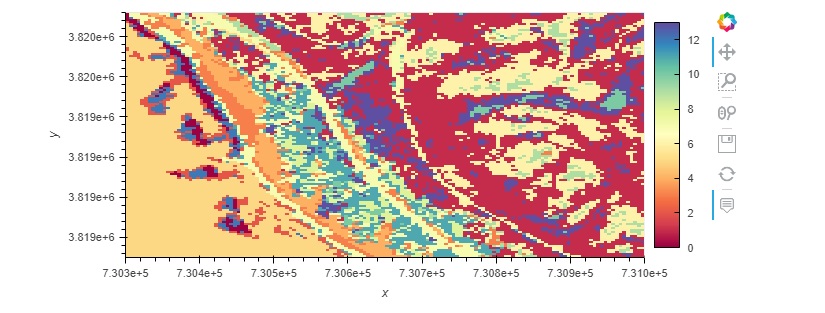
# Create a Map using the Kmeans labels and the coordinates from the original xarray dataset

# Pull x and y values
y = aoi['y'].values
x = aoi['x'].values

# Create new rgb xarray data array.
data_vars = {'kmeans_labels':(['y','x'], kmeans.labels_.reshape(aoi.dims['y'], aoi.dims['x']))}
coords = {'y':(['y'], y), 'x':(['x'], x)}
attrs = aoi.attrs
ds_labels = xr.Dataset(data_vars=data_vars, coords=coords, attrs=attrs)
ds_labels.coords['x'].attrs = aoi['x'].attrs
ds_labels.coords['y'].attrs = aoi['y'].attrs
ds_labels.kmeans_labels.hvplot(cmap='spectral')

Gaussian Mixtures
# Fit a GM model with the data
gmm_model = GaussianMixture(n_components=14)
gmm_model = gmm_model.fit(pca_df.drop('kmeans_labels', axis=1))

# Add the predicited labels to the dataframe
pca_df['gmm_labels'] = gmm_model.predict(pca_df.drop('kmeans_labels', axis=1))
pca_df
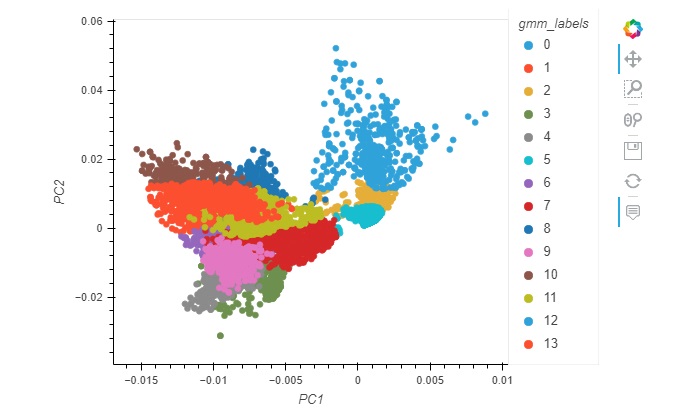
# Use the hvplot pandas extension to create a scatter plot
points = pca_df.hvplot.scatter(x='PC1', y='PC2', by='gmm_labels',
                 height=400, width=600, cmap='spectral')
points
- ::
# Add the labels to our xarray labels dataset and plot the map ds_labels = ds_labels.assign({‘gmm_labels’:([‘y’,’x’],pca_df[‘gmm_labels’].to_numpy().reshape(aoi.dims[‘y’], aoi.dims[‘x’]))}) ds_labels.gmm_labels.hvplot(cmap=’spectral’)